Windows 8 First Impressions
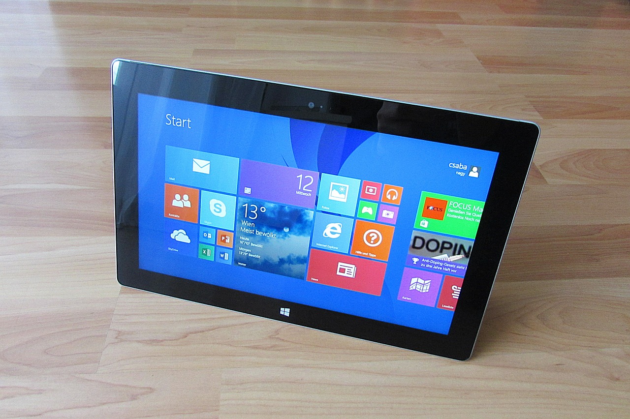
 I took a plunge and decided to run Windows 8 consumer preview as my main OS. I realize it is beta and expect lots of issues, it is given. If there are real showstoppers I might even go back to Win 7, will see. But for now it looks ok and I want to share experience in case someone else thinking about making a switch.
Compatibility
It supposed to be "Windows 7 plus" from hardware perspective, but looks like some drivers might have issues. On my desktop with dual-booted developer preview, consumer version could not handle wireless driver and failed to install. Weird, I'd expect things moving in other direction but well... From the software perspective, some vendor specific applications may not work, require update or re-install. Good news is setup will tell you that up front so you can decide if you want to proceed. In my case, couple Samsung utilities and few applications that I also use on my desktop PC were reasonable sacrifice. For applications that compatible with Windows 8 you still might expect few glitches, it is a beta after all. Heavy-weights like Visual Studio, for example, can give you a headache. I experienced couple hang-ups and had to restart VS to bring it back to life. I hope Microsoft monitors these kind of things and will push updates and fixes, so far that seems to be true as I already have seen couple updates and they seem to help make system more stable.
If PC does not have touch screen, will I hate it?
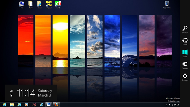
My machine is Samsung laptop with no touch screen; it's all keyboard and mouse all the way. I see a lot of people complaining that for such configuration Windows 8 makes no sense, but I think it depends on how you use it. Right now most of the applications you going to run are desktop apps, and if you using Metro just as launcher for desktop, well, yes it is kind of pointless and even annoying. You walk through the place where all fun supposed to happen straight to old boring desktop that looks even more limited than it was in Windows 7 – how is that better? There are improvements on desktop, but they not very visible, mostly under the hood and those that you run into not particularly exiting and often look out of place. Metro does not mix well with regular windows. So, do I hate it? No. Since developers preview, it got a lot more keyboard/mouse friendly and switching between Metro and desktop very smooth and intuitive. Pretty soon you start forgetting that you running two very different environments and as more Metro apps become available I expect things to get even better. The main point here, even with regular laptop using Metro is fun and enjoyable experience. At least, it is for me.
Dude, where is my start menu?
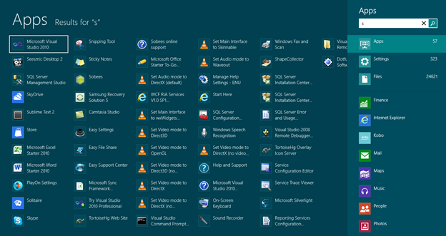
One of the common complains is about removed start menu. It actually not really removed, rather Metrolized – and I'm personally ok with that. How did I use start menu before? Hit "windows" key and start typing application name, when it is on top in the list hit "enter" and you done. Same exact thing in Windows 8, just instead of list opening in the lower-left corner you get it full screen with search and some helpful options in the right sidebar. It is visually different, but there is no learning involved and after getting used to new UI it seems more natural. No problem here, moving on.
Tiles
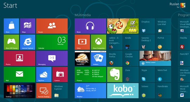
To me tiles are just smarter icons – period. It can look ugly or pretty, depending on developer/artist who created particular tile. I guess nice looking tiles will sell applications and it will drive quality up. As of now, they are a little limited and not a whole lot you can do to customize tiles to your own likings, but I expect it to change later. Things like grouping related tiles into "folder" with parent tile been able process and show child notifications, changing icon and color etc. would be nice in the next version. For v1 it is good enough. And tiles give developers ability do things not previously possible, it is in fact mini-app that can run in the background and display messages and notification, interact not only with own back-end but also with other applications over channel provided by Windows runtime. No icon has ever dreamed of such things!
Metro UI
Odd thing about Metro is how it is not picture friendly. If you look at iOS screenshots next to Metro, comparison is not flattering. Next to refined rich graphics with pretty outlines and drop shadows Metro looks plain, flat and simplistic. But ask anyone using it for a while and people say they love it. Reason is it is beautiful in motion. Put same iOS device next to Windows phone, and you'll see that one is too busy, cluttered and confusing while other is clean and elegant with beautiful transitions that do make it look alive and joy to use. Same with Windows 8 – some people call it ugly, but start using it and it is most natural thing in the world. You can see where that "fast and fluid" slogan coming from. Fluid navigation style combined with underlying contracts used for applications to communicate with each other and OS itself provide very powerful system and it feels like Microsoft barely scratches surface realizing its potential. This can be pushed very far in the coming years.
Applications
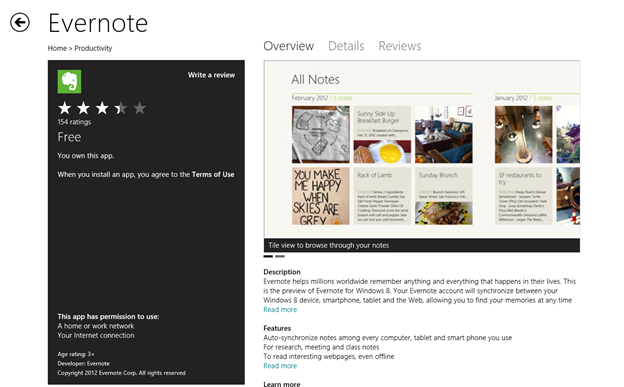
Metro apps I used look really nice on 16 inch screen. Games like "cut the rope" are obvious eye candies, weather and finance apps look gorgeous. Evernote is a solid productivity app. With many more apps coming, I suppose time spend on desktop will shrink and Metro will come front and center, hopefully bringing better user experience. It is built from ground-up to run safe and responsive applications in the sandbox. If I won't see "not responding" messages again, I'm going to live happily in this sandbox and never go out. That is, if applications will get more functional and full-featured. Take for example Evernote. Metro version looks great, but it is perfect example of consumption vs. creation. You can't add new note, you can't modify existing – it is read only stripped down version that only makes sense on tablet. And even there I'd expect basic editing functionality, like ability to take picture, tag and save as new note. So those Metro apps need to get way more sophisticated for desktop users to care. Right now, it is glorified little gadgets. It would be smart for Microsoft to launch final release with few big-ticket Metro applications to showcase what platform has to offer.
Is it ready for primetime?
It went long way from developer preview; still it requires a lot of polishing. Inconsistencies between apps don't look like a big deal but they have aggregating effect and ruin overall good impression. In some applications you can scroll with a mouse wheel, in others it does not work but you can use left/right arrows, in some you have to drag scroll bar – this feels sloppy. Sometimes simplicity gets into way of very basic functionality – it is unnecessary hard to add new email account after initial setup, change sound volume, restart computer etc. Also, did I mention it is beta? Betas are crashy and not very stable, this one is no different. Unlike developer preview it is actually usable, but don't expect butter-smooth ride or you'll be disappointed. If you not adventures mind with healthy nervous system, you might wait for final release or at least use VM or dual boot.
