How to convert theme to BlogEngine.NET part 3

This is part 3 of converting theme to BlogEngine tutorial. In the first part we created a new theme and added HTML/CSS/JavaScript from chosen design template. Second part mostly dealt with customizing search. Today is going to be a widgets day.
Widgets are parts of the site that can be dynamically configured and updated by admin, usually you can see them in the side bar, like list of categories, tags etc. It is one of the main extensibility points in BlogEngine and can be very powerful, although you should not overuse it as having too many widgets can slow site down.
Widget Zones
Widgets can only exist inside of container, in BlogEngine term – zone. Since BlogEngine 1.6 you can have multiple zones (more on it here). Boldy will be using 2 widget zones, so your code base should be relatively up to date or you’ll need to remove second zone from the theme and replace it with hard-coded content. If so, you can copy and extend this content from the theme from part 1 or 2. One of the widget zones we will put in the sidebar:
<div id="colRight">
     <blog:WidgetZone ID="WidgetZone1" runat="server" ZoneName="be_WIDGET_ZONE" />
</div>
And the other goes to the footer section:
<div id="footerWidgetsInner">
     <!-- BEGIN FOOTER WIDGET -->
     <blog:WidgetZone ID="WidgetZone2" runat="server" ZoneName="PageBottom" />
</div>
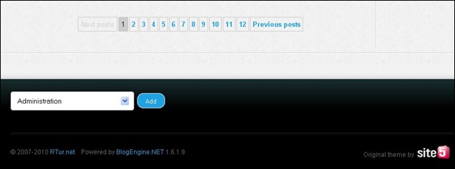
Now we should have drop down added to each place where widget zone is defined. For example, here it is in the footer (sure you have to log in as admin to see it):
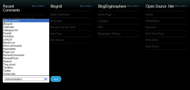
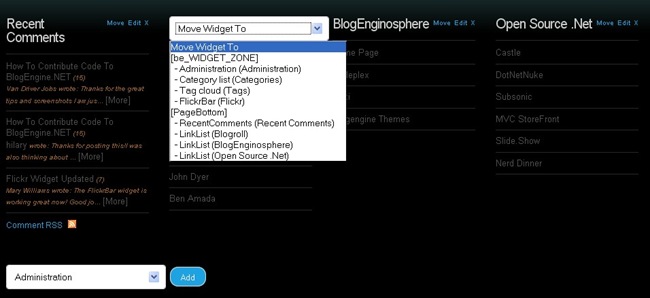
Now you can add widgets to the zones. Once added, you’ll see menu items on every widget that let you edit, delete and move widgets between zones and also within zone:
The move menu:
Customizing widgets
Widgets added to the site might not look right in the new theme at first. As responsible theme author, I’d want to add every single widget to the sidebar and check out what it looks like. Next step is pulling all widget-related CSS from standard theme and modifying it if needed to fit with new design. Its not a walk in the park but not terribly complicated either, just requires some patience. Most widgets are unsorted lists and biggest problem is to make it work with both flat and nested lists. FireBug is your friend. Footer widget is a special case, we probably don’t need every widget look great inside it – just those that likely to be used.
CSS is sometimes not straightforward in a way one style takes precedence over the other which can be really annoying. One handy trick you can use is telling CSS parser that this style should be top priority over all others by using “important” keyword. I would suggest using it as last resort only, but again if you not accomplished CSS guru you might be tempted to throw towel quite often. I won’t blame you:
margin-left: 0 !important;
Overall this part is not much different from tweaking comment form – you load page and use FireBug to examine HTML and styles and do adjustments as needed.
Updated theme can be downloaded using link below:


